140 characters

Team: Adriana Chiaia, Cyrus Clarke
Links: CIID website
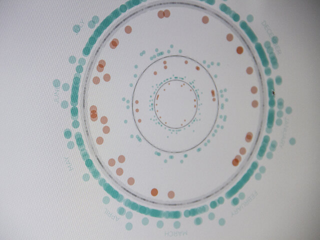
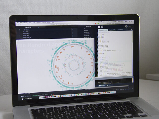
This data visualization is an exploration of the happiness of CIID’s IDP students during the one-year course.

Following the brief of visualising CIID’s alumni network, this visualisation shows every public tweet sent from students during their time on the Interaction Design Programme. When selecting different cohorts, their tweets are analysed and sorted by their positive/negative emotions. As a result, you can get an immediate feeling of the up and downs of one particular year – and even the times of stress they all share.

This visualisation uses a data set that was mined with the help of a web crawler. A sentiment analysis, done in Processing, separates the tweets into 7 categories of happiness.

It is worth mentioning that there is an irregularity in the end of every year, where the number of tweets drop significantly – probably because of high stress levels during the final sprint.

Data Visualization of CIID's IDP Students

Processing.org sketch of Data Visualization

Sentiment Analysis

Data Visualization Prototype with Pen and Paper